Who?
According to the bio on his website, Kyle Alexander is a freelance photographer/director, born in Texas, moved to Hawaii to shoot surfing and then re-located to the LA area. There is a very interesting link to an interview he did with the people at aPhotoEditor, so be sure to check that out!
If I would have to describe his style in 3 words, then I'd settle on Genuine, Sun-kissed & Moments. If you go through his portfolio books, you instantly get a warm feeling. His pictures do not have the technically perfect 'Photoshop' label written all over them. Instead they have a high documentary value to them, moments in time captured by a talented eye. Genuine moments with real people, captured in gorgeous light (mostly setting or rising sun feel) conditions.
Check out his portfolio here.
The picture

Click Click Bang
Mood
This photograph just oozes Good Vibrations, as if the Beach Boys wrote their song inside the same car. The people in the car look genuinely happy and content. The story that I like to build around this photo is a group of friends going on a road trip in a vintage car with no specific destination in mind. They go with the flow, see where the road will bring them. A summer festival, surf spot, campfire, ... are other ingredients that work well within this story. Every time a photograph inspires you to daydream and build your own story, it has reached one of its goals.
Lighting
The sun is the prominent light source in this picture and it's clearly visible in the frame, as the blown highlight in the rear window. If there is no use of reflectors or extra lights, it's either exposing for your subject (resulting in the 'hot' highlight) or the background (resulting in a silhouette picture).
Most photography books will teach you to avoid blowing out highlights. There a lot of ways to do this: balance fore- and background by using (strobe) lights or reflectors; use graduated ND filters; make sure that the dominant light source is not in the frame ... This picture proves that all rules can be broken and that it can result in a very compelling image.
Composition and details
Most people tend to place their subject in the center of the frame, generally resulting in a 'boring' image. One of the major techniques for making images instantly more compelling, is using the "rule of thirds", a concept known to every photographer, amateur and pro alike. The rule proposes that an image should be imagined as divided into nine equal parts by two equally spaced horizontal lines and two equally spaced vertical lines, and that important compositional elements should be placed along these lines or their intersections. In other words you divide a picture in 9 equal squares and you put the the main focus/message on the intersections of the outside lines.

Now we all love to break the rules now and again, especially if they are used a lot. The man, who is taking a photo (of the photographer in this case), is placed in the middle of the frame and nothing is really happening on the exact intersections of these grid lines. Nevertheless I find this image compelling, thanks to the details, color, mood... and maybe also composition.
The rule of thirds is not the only theory about composition that is out there. I tried the one about the Diagonal Method (DM) on this image and the result is quite interesting. The technical explanation for the DM is simple: a typical 35mm picture is a rectangle (landscape orientation) with a ratio of 2:3, which allows you to draw 2 overlapping identical squares on top of it. You then draw 2 diagonal lines (corner-to-corner) in each square, resulting in 4 intersecting lines. Extensive research has shown that several famous classical painters have placed important parts (eyes, objects, gestures) of their paintings right on these diagonal lines.
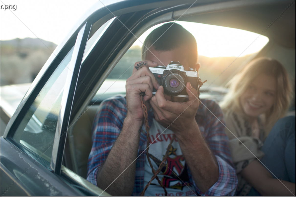
As you can see in the picture with the diagonal overlay (which you can select in Lightroom in the cropping tool), there is a nice observation to make. The diagonal line that starts from the bottom right corner intersects perfectly with the camera he's holding and if you would be able to see the subject's eye, it would run over it as well. The viewers attention is drawn to the camera, as was intended by the photographer (I hope :-)).
To finish, something completely different, but easily one of my favourite parts of this image, is the tattoo detail on the trigger finger. It is not perfectly in line with a diagonal line (close enough though), but compelling none the less. It is sure to put a smile on quite a few people (me included) and that is a great thing in its own right.
BANG!